.png)
HMW spread awareness on the different events Ateneo has to offer?
One such avenue that aims to promote the different Ateneo events is the Ateneo Events and Promotions Facebook Group. Despite the creation of this group, Ateneo students rarely visit it because they struggle with scrolling through numerous uncategorized posts while they are searching for an event they are interested in.
We interviewed 3 stakeholders, all are Ateneo students who play an active role in their respective organizations. Our goal was to understand how they perceive the Ateneo Events and Promotions Facebook group—their thoughts, motivations, pain points, as well as ways on how their frustrations might be resolved. In addition to these, we also asked them questions regarding their behavior when it comes to events.
After conducting user interviews, we identified the user needs:
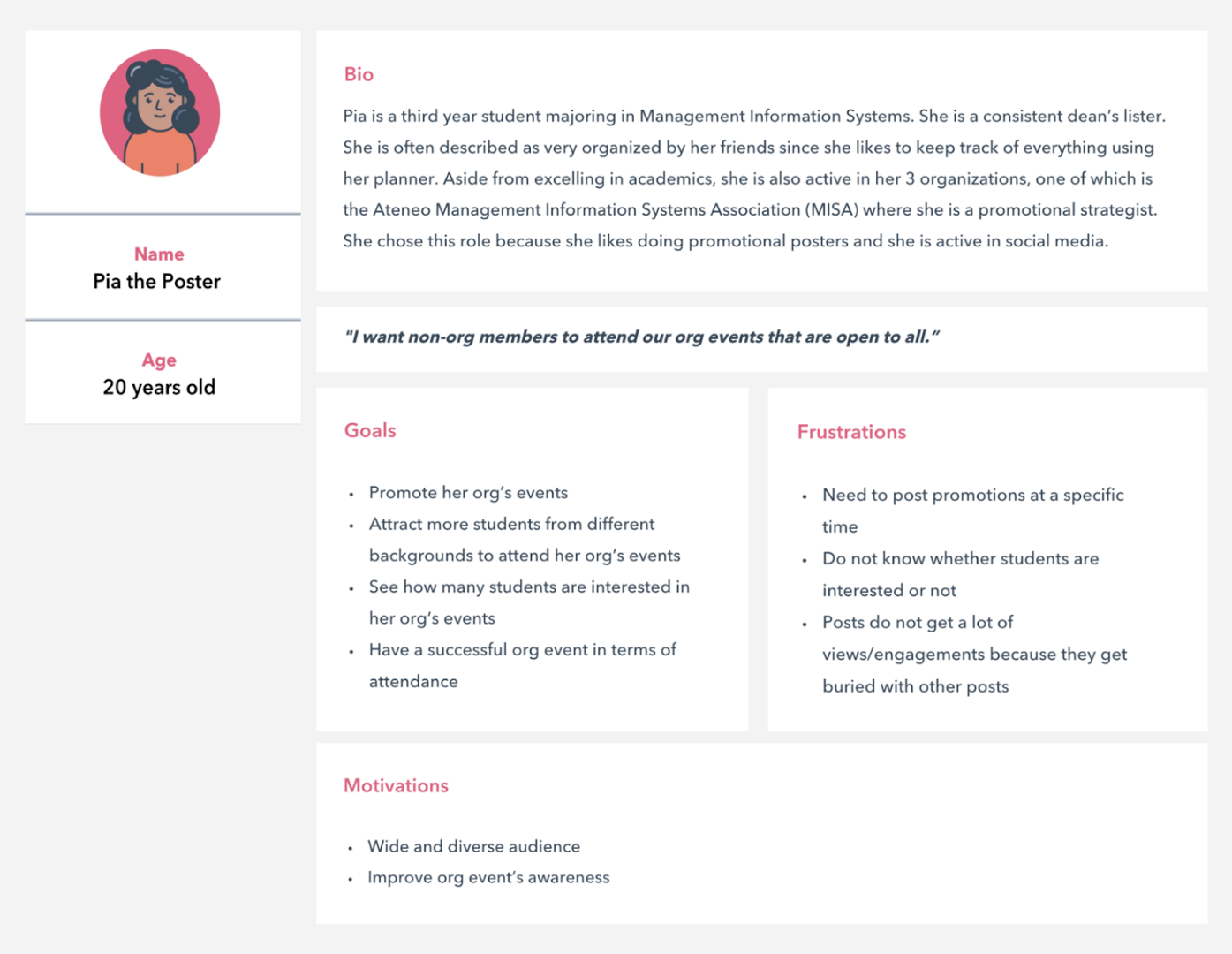
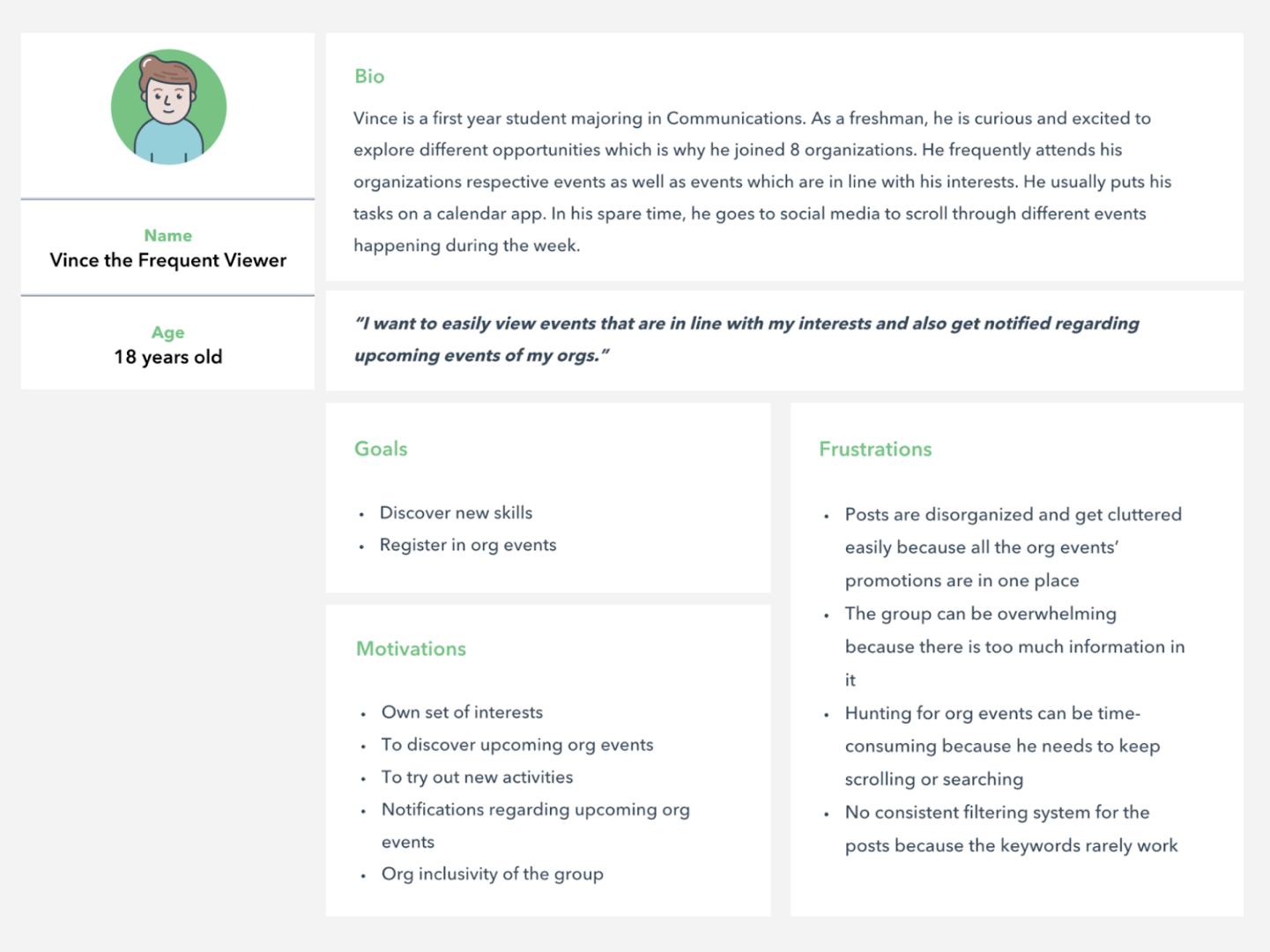
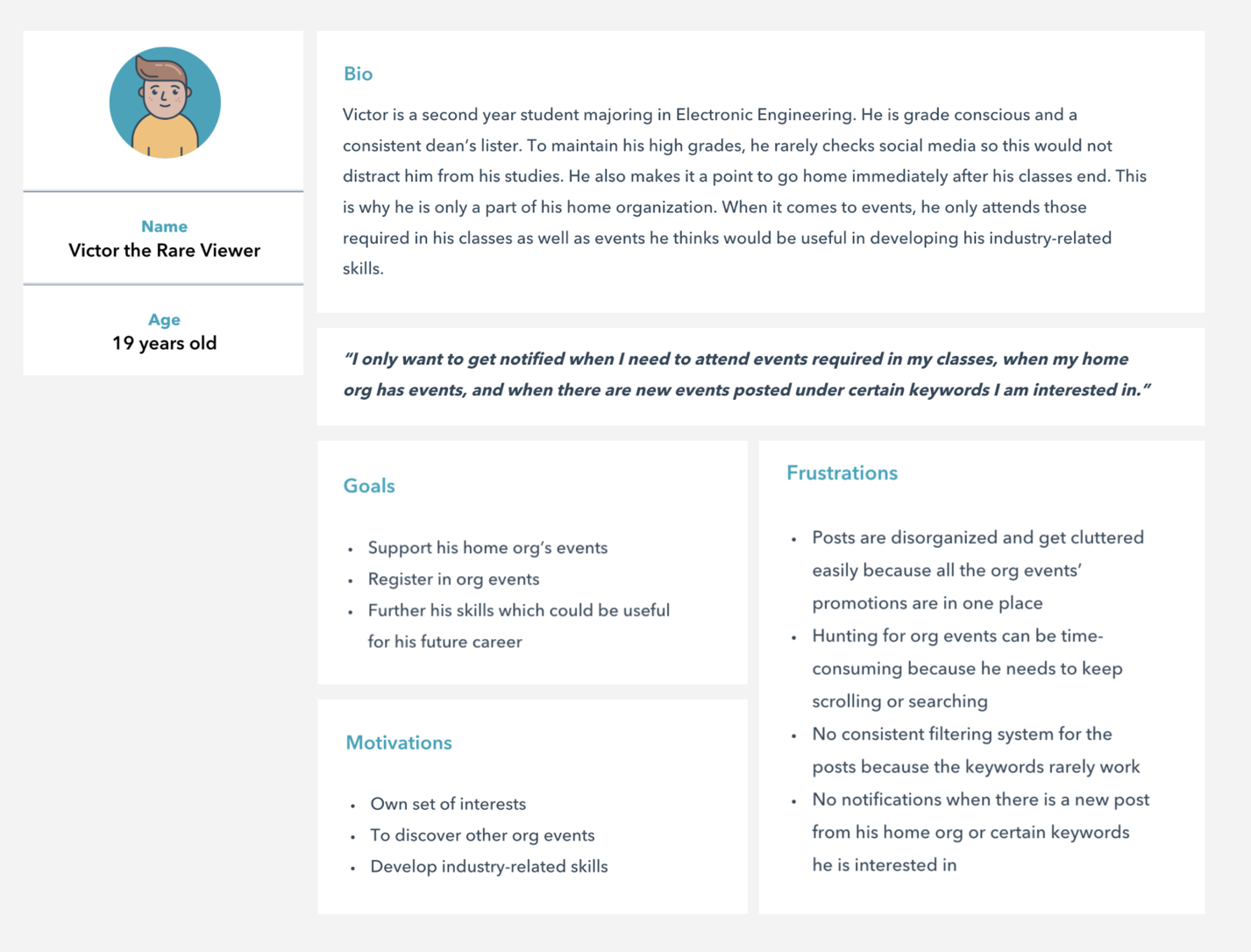
Based on our findings during our user interviews, we created 3 user personas:
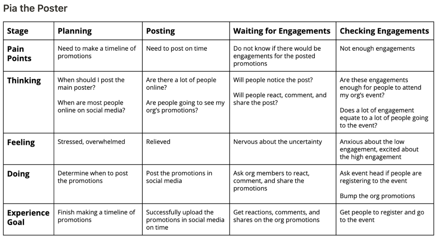
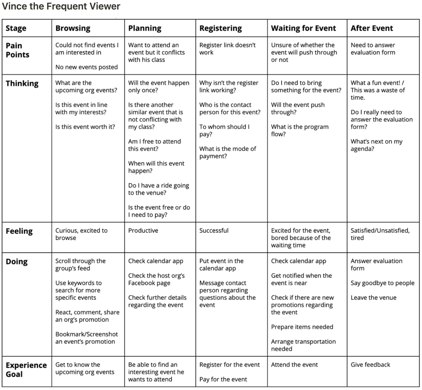
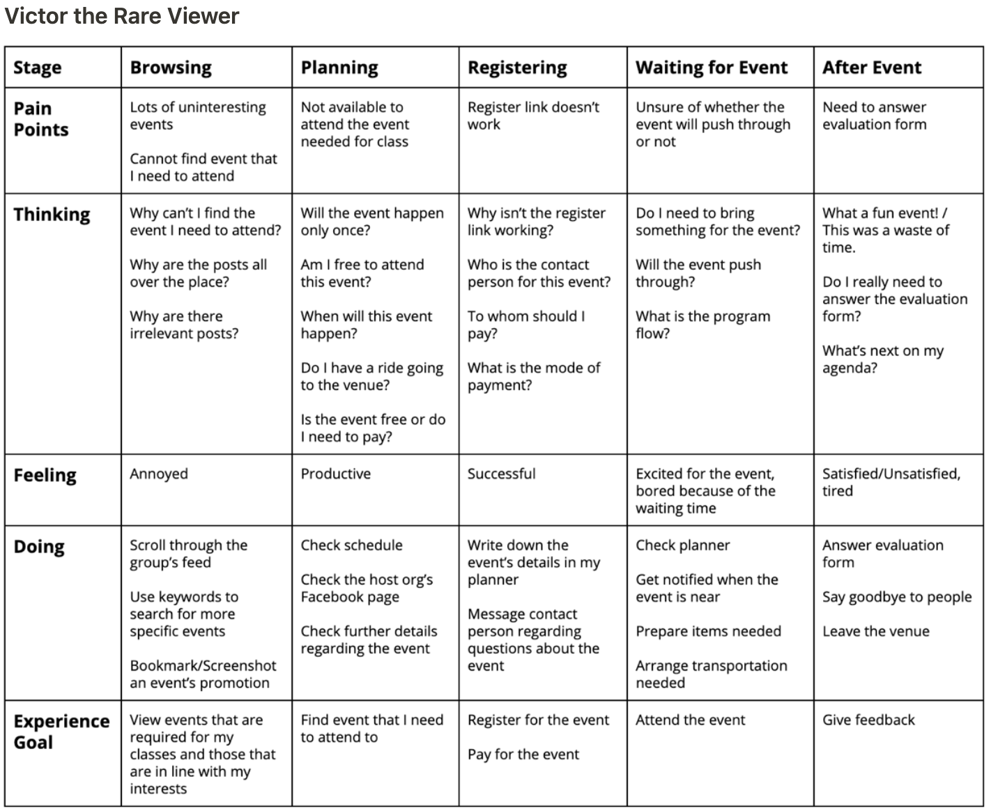
In order to properly visualize our personas’ relationships with the Ateneo Events and Promotions Facebook group, we made journey maps for them.
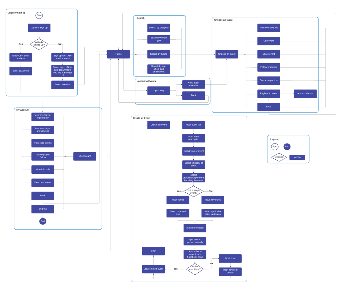
We made the user flow to keep track of all the needed screens our designs need to have and lay out the process users will go through to navigate through our website.
We started our designs by creating wireframes to lay out the foundation of the product. Then, we designed the mock-ups. Lastly, we fixed the prototype to experience the whole website.
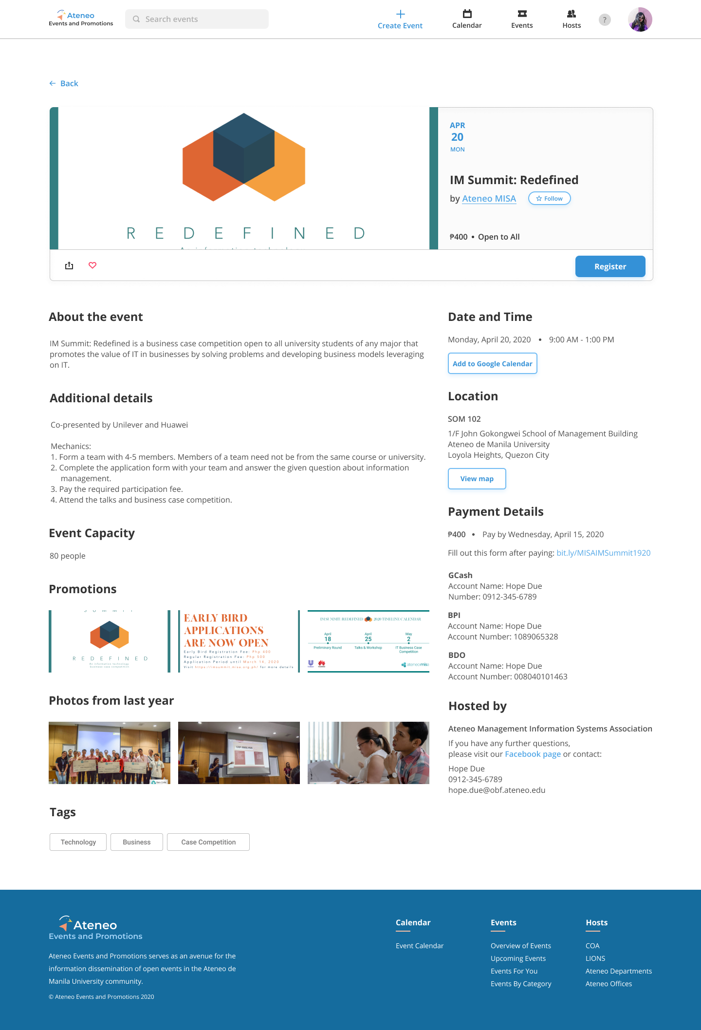
To address the concern regarding event posts getting buried easily, we designed the home and events pages in a way that events are separated by categories.
Since our stakeholders want to easily see event details—description, date, time, location, price and contact numbers—and expressed how they want to easily add the event to their own calendars, we added these in our events details page.
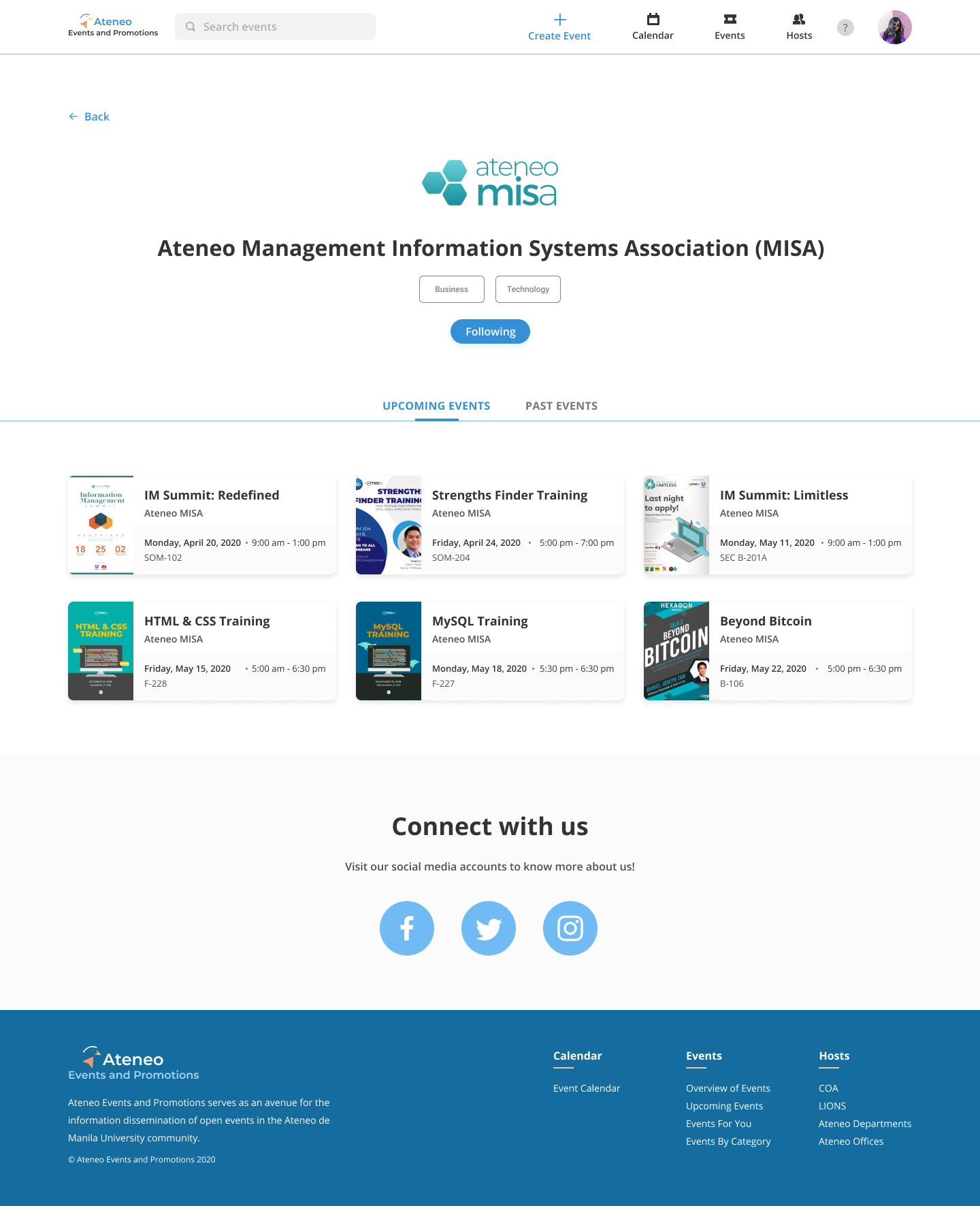
They also stated that they would like to see pages for each org and including the offices and departments of Ateneo would be a nice addition, since they don’t see many posts from them.
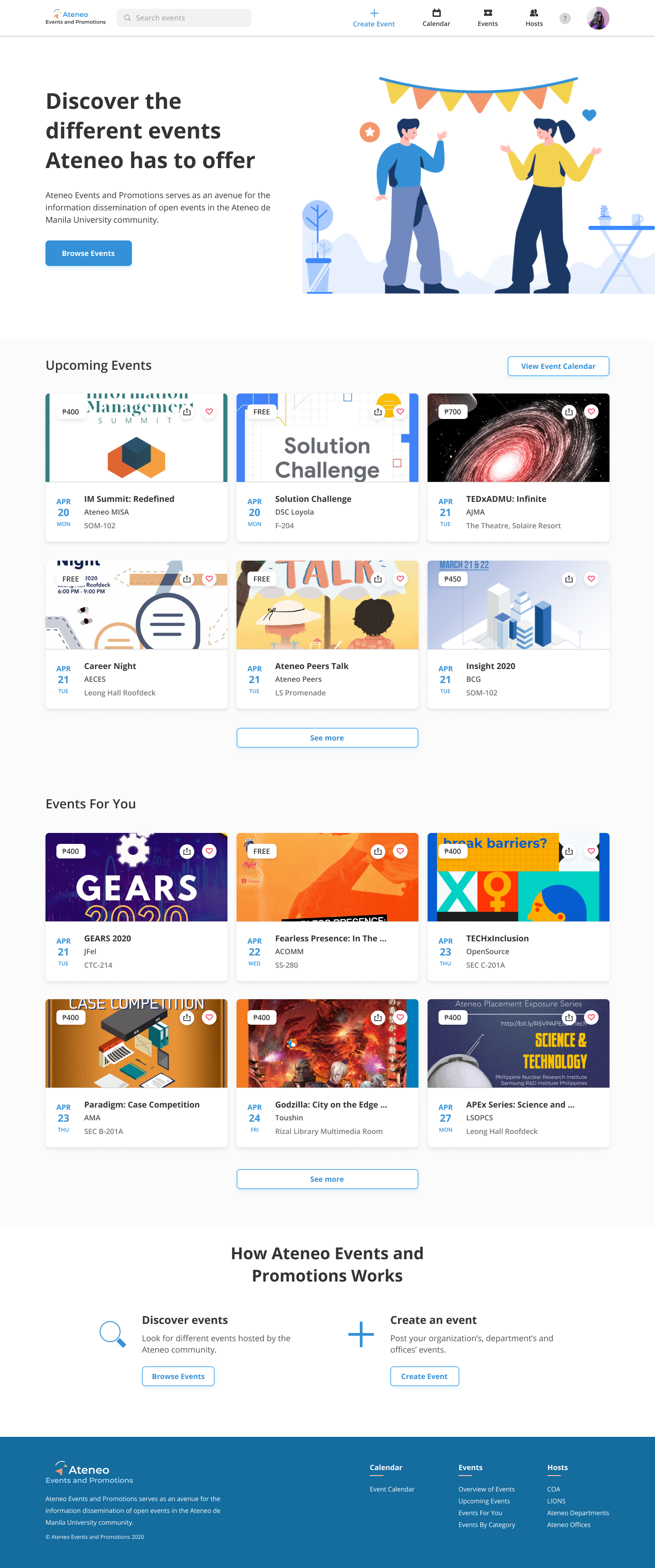
We went for a vibrant tone in our design since students are our main users and various events from different organizations and departments are showcased here. We chose blue as our primary color because it is Ateneo’s color while orange as our secondary color because they are complementary colors. For our logo, we incorporated an eagle to symbolize Ateneo’s Blue Eagle mascot.
To understand how our stakeholders navigate through our product and to measure its usability, we conducted user testing. The user tests were conducted remotely through the combination of Maze, Google Forms, Facebook Messenger voice call with screen share, and Google Hangouts with screen share.
We tested our product with 3 users and assigned them 4 main tasks:
We learned that our users had a great overall experience with our product because they said it was easy to learn and very comfortable to use especially in terms of navigation. All users see themselves using the product because they perceive it as useful and as a tool for productivity.
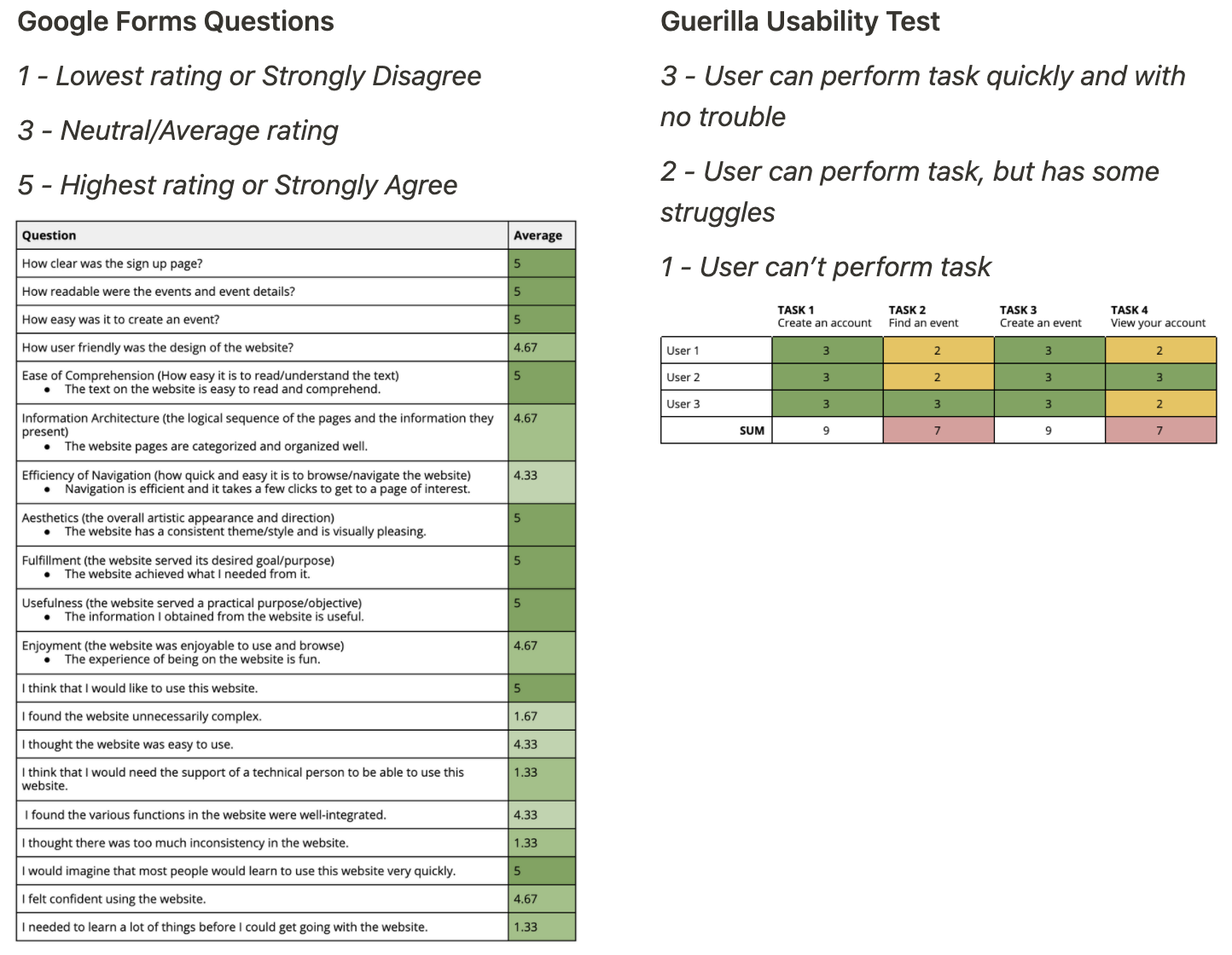
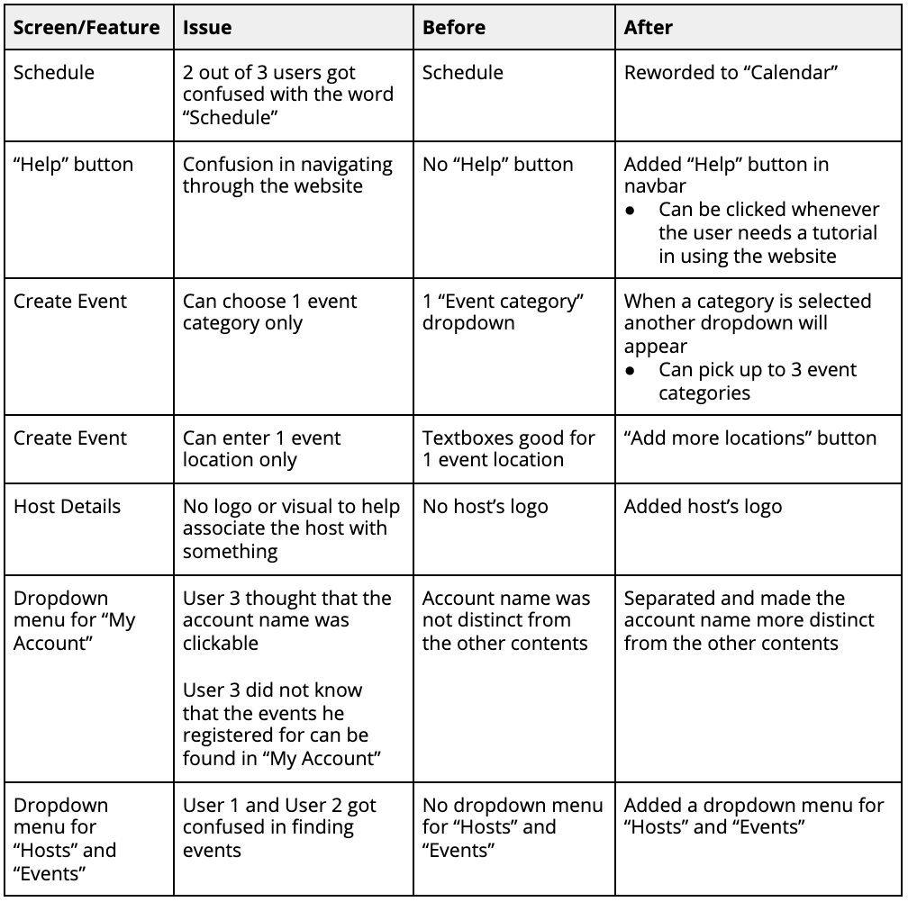
Based on our user testing, there were still some issues the users faced, so we addressed these.
Despite this being our first UX case competition, we were able to get 1st place out of 30+ participants!
Joining and winning UX University 2020 started my UX career, since I gained more confidence in grabbing more opportunities and was able to get a better understanding of UX.
Looking back at the product, I could’ve used components properly, since this can make designing faster and easier. When I was designing, I would manually change all the buttons, cards, and other elements in different pages, which took a lot of time and effort. I could’ve also used the 8pt grid system to make the spacing consistent. If we had more time, I could’ve made mobile and tablet versions of our product.