.png)
HMW showcase all MadEats brands without overwhelming users?
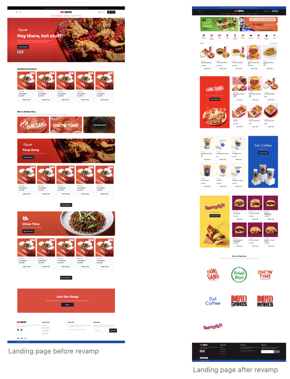
Before, the web store only shows MadEats brands on the navigation bar, which makes it hard for first-time users to look for specific meals. They need to click on the different brand pages to view their different products. Some products don’t get noticed since they’re at the very end of the brand page.
My teammates and I listed down problems of the web store. Then together with the other members of the tech team, we voted on which ones we should prioritize first. We ended up with the following problem statements:
I focused on the first two, while our developer handled the last one.

I looked through different web stores to see how they showcase their products. I noticed that most of them categorize their products, which really helps users see the products they’re looking for as well as better navigate the web store.

I designed the home page first, since that’s the first page users see when visiting the web store. I focused on the navigation bar and the overall layout of the home page.
For the navigation bar, I removed the different brand pages and replaced them with categories. For the home page, I added menu categories to show users the different products we offer, brand posters to entice users to check out the brands, and brand logos to showcase the different brands we have.
I also made the promo banner smaller to show more promos at a glance without taking too much space real estate.
The checkout experience was the next on the priority list, since our operations team mentioned that dispatchers encounter wrong location pins and some customers not knowing where to input promo codes.
Before designing, I asked the developers which part of the checkout experience can be redesigned. They mentioned that we can only redesign the cart page since the checkout pages can only be customized if we’re on Shopify Plus.
After the meeting, I designed the cart page and tried to give it the same look as the mobile app for uniformity. I added new features:
Note: Full design hasn’t been implemented yet due to low manpower

Throughout designing the home and cart page, I was able to conduct design reviews with the product and tech teams which helped me improve my designs.
Based from design reviews and company-wide meetings, the team thinks that the web store is easier to navigate and that the overall look of the home and cart pages improved. Booking delivery riders became easier for our dispatchers since a text field for location pin/landmark has been added.
I learned that conducting regular design reviews can help me get feedback and improve my designs faster. I also learned that it’s important to consult devs about feasibility to ensure that I don’t waste any time and that my designs wouldn’t go to waste.