.png)
HMW make ordering experience more efficient and seamless?
Since Dot Coffee is our top brand, we want the ordering experience to be more efficient and seamless so customers can easily order their coffees. Even though we currently have an existing MadEats web store, it has its limitations, especially when it comes to order tracking. Customers always ask about the status of their orders and our customer support replies to them manually. We can’t add order tracking because we can’t fully customize the web store due to Shopify constraints.
Before the Dot Coffee mobile app, I have already designed the MadEats mobile app. But because of the executive decision to push for the former, I took what I already created and changed the branding.
I studied the UI/UX of Flash Coffee and harlan + holden to understand their design patterns.
Since the company grew significantly, opening more cloud kitchens and kiosks and catering to more customers in the metro, the current features of the MadEats mobile app wouldn’t suffice. Eventually, it was decided that we add more features, so users can see the value of downloading the app.
Here’s a table comparing the features of the two. The ones in highlight are new/updated features.
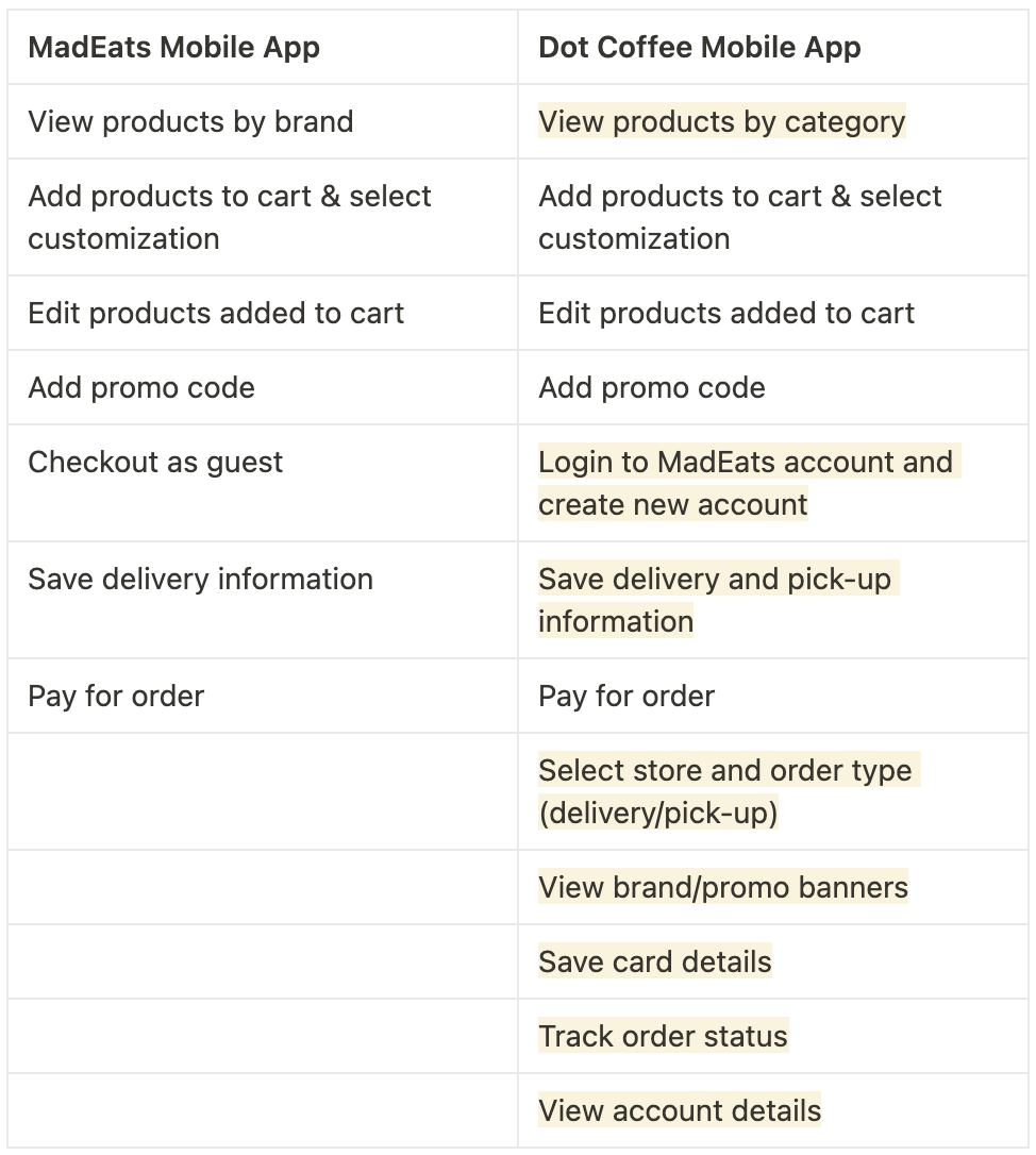


Since I added new and updated features, the previous user flow had to be adjusted. One major feature that we added is the ability to login and create an account, which replaced the guest checkout feature.
Users will now have to login or create an account to be able to place an order. Because of this, we added a login/sign-up screen at the start of the flow. Even if we placed an additional step, the ordering flow will be faster and more convenient in the long run, since users skip the process of having to add their card details every time they checkout.
For existing MadEats customers, who already created a MadEats account, they don’t have to worry about adding delivery information all over again. As long as they login using their existing MadEats account, the information is carried over to the Dot Coffee mobile app.
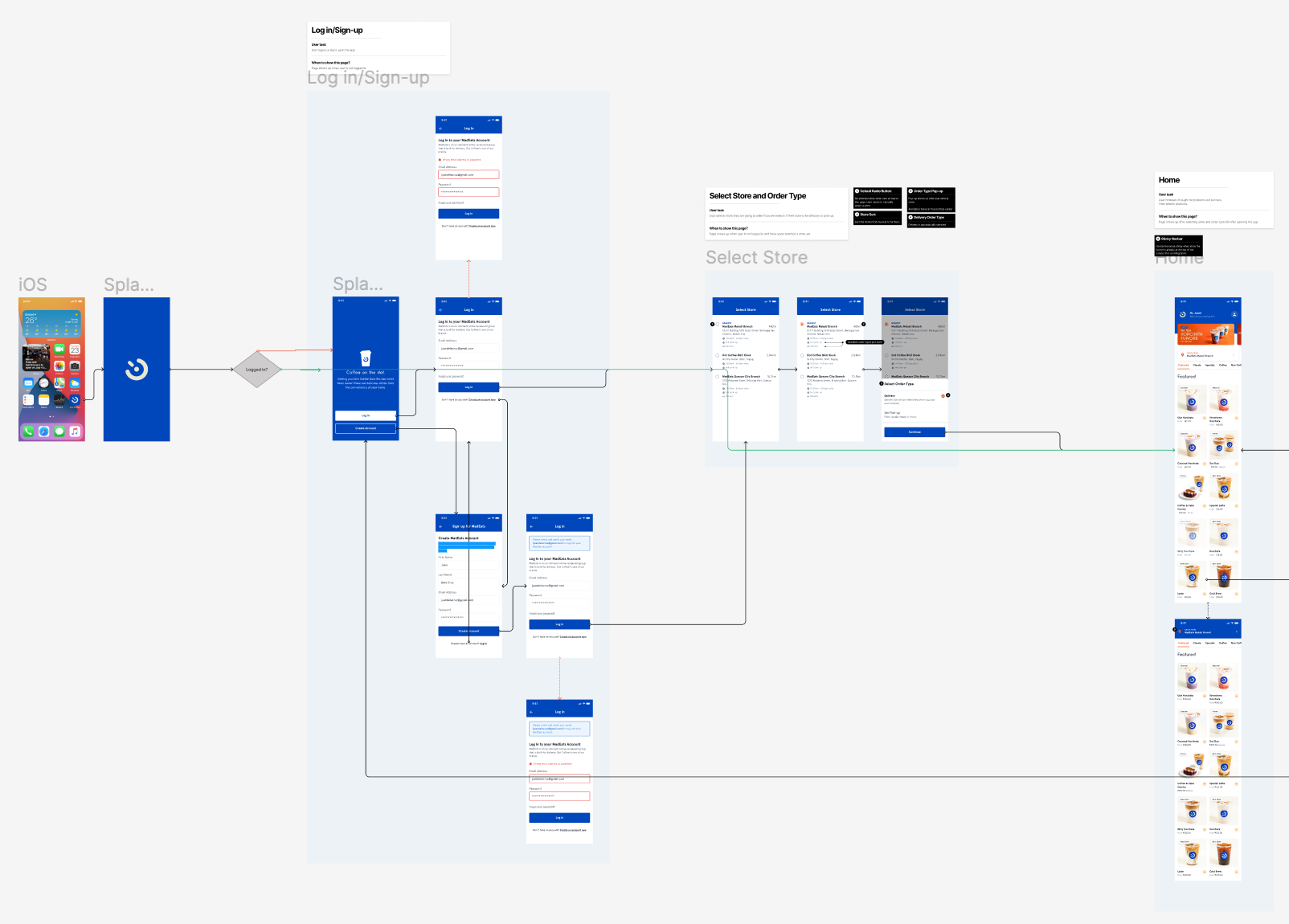
After finalizing the designs and user flows, I created the hand-off file for the devs to clearly see what happens when the user interacts with the different features. The file includes the different features, feature descriptions, user stories, user flow, and final designs.

By adding more valuable features, like order status tracking and login/create account, the team sees that the ordering experience is a lot smoother compared to the MadEats mobile app. Customers don’t need to go out of their way to ask customer support for the status of their order, since we immediately show it after they successfully checkout.
I learned that I should establish the user flow first before giving the designs to the devs so that they know where to connect each screen. When I finished the user flow, that’s when I realized that I missed designing some screens.
Note: The mobile app is still in the development phase and will do an internal user test within the company first before publicly releasing.